Why Multi-Step Forms Convert 86% Better (And How to Build One in 60 Seconds)
I spent three months testing every form builder I could find before launching Crispforms. The pattern I kept seeing? Marketers obsessing over removing fields while ignoring the actual problem—how those fields are presented.
A 15-question form split into steps outperforms a 5-question form crammed onto one page. I’ve seen it happen dozens of times. The difference isn’t the number of questions. It’s whether your form feels like a conversation or an interrogation.
What Makes Multi-Step Forms Different
A multi-step form presents questions one at a time (or in small groups), revealing new fields only after the previous step is complete. Progress bars show users how far they’ve come and what’s left.
Traditional forms dump everything on a single page. Users see all 10, 15, or 20 fields at once. Before they’ve typed a single character, they’ve already calculated how much work lies ahead—and many decide it’s not worth it.
When someone sees a form with two visible fields and a progress bar showing “Step 1 of 4,” their brain processes this as four small tasks. When they see the same eight fields on one page, their brain processes it as one large task. Same questions, completely different user experience.
The 86% Conversion Advantage: Where the Data Comes From
HubSpot’s research found that multi-step forms generate 86% more conversions than single-step forms for lead generation. WPForms reported similar findings—only 40% of marketers use multi-step forms, but those who do see dramatically higher conversion rates.
A separate analysis by Plerdy found multi-page forms average 13.85% completion rates versus 4.53% for single-page forms—roughly 3x the conversions from the same traffic.
The Venture Harbour team documented even more dramatic results. When they switched from a traditional contact form to a multi-step version, conversions jumped from 0.96% to 8.1%—a 743% increase. On a B2C financial site, completion rates rose from 11% to 46%.
| Industry | Single-Step | Multi-Step | Improvement |
|---|---|---|---|
| B2B Consulting | 0.96% | 8.1% | +743% |
| Financial Services | 11% | 46% | +318% |
| SaaS Registration | 4.53% | 13.85% | +206% |
| General Lead Gen | Baseline | +86% | +86% |
Why Your Brain Prefers Multi-Step Forms
Three psychological principles explain why multi-step forms outperform traditional ones.
- The Completion Bias: Humans have a deep need to finish what they start. Once someone completes Step 1, they’ve invested effort. Walking away means abandoning that investment. Each completed step increases commitment to finishing.
- The Progress Principle: Visible progress motivates continued effort. When a progress bar shows “60% complete,” users experience a small dopamine hit. Studies show starting a task with visible progress increases completion rates—that’s why effective multi-step forms show the progress bar partially filled from the start.
- Reduced Cognitive Load: The human brain can only process about four pieces of information simultaneously. Show someone 15 form fields, and you’ve exceeded their cognitive capacity. Multi-step forms keep each screen within limits—users can focus completely on the current question without feeling overwhelmed.
The Hidden Cost of “Shorter is Better” Thinking
The conventional wisdom says fewer fields mean higher conversions. This is technically true in isolation—remove a field, and abandonment at that field drops to zero.
But shorter forms collect less data. Less data means weaker lead qualification. Weaker qualification means your sales team wastes time on unqualified leads.
I talked to a marketing agency that had trimmed their lead form down to just name and email. Their form conversion rate looked great on paper. Their lead-to-customer rate was abysmal. They had no idea which leads were worth pursuing.
Multi-step forms solve this trade-off. You can ask for company size, budget range, timeline, and use case—information that makes leads actionable—without tanking completion rates.
What Separates Good Multi-Step Forms From Bad Ones
- Start With Low-Friction Questions: Your first step sets the tone. Starting with “What’s your email?” triggers defensive instincts. Starting with “What’s your goal?” engages curiosity. The best opening questions feel like the start of a conversation.
- Keep Steps to 1-2 Questions Each: More than two questions per step reintroduces the overwhelm problem. Each step should feel instantly completable.
- Save Sensitive Questions for Last: Email addresses and phone numbers go at the end. By this point, users have invested time and developed commitment. Asking for contact info first is like proposing marriage on a first date.
- Use Visual Selection Over Text Input: Every text field is a friction point. Button selections, image choices, and sliders remove this friction. “Click to select” beats “type to answer” almost every time.
- Show Meaningful Progress: A progress bar should tell users where they are and how much remains. “Step 3 of 5” communicates both clearly. Avoid percentages that move unpredictably.
How AI Changes the Multi-Step Form Equation
Building an effective multi-step form used to require careful planning. How many steps? Which questions go where? What’s the optimal flow? Get it wrong, and you’ve built an expensive A/B testing exercise.
AI form builders flip this equation.
When you tell Crispforms “I need a lead qualification form for a marketing agency,” the AI doesn’t just generate questions. It determines the optimal step structure based on patterns from high-converting forms. The AI considers question types (text creates more friction than buttons), logical groupings (related questions belong together), and psychological sequencing (start easy, save contact info for last).
The 60-Second Build Process
Traditional multi-step form building requires mapping questions, deciding step structure, building each step, configuring progress indicators, adding conditional logic, and testing the flow. This takes hours.
With AI-powered generation:
- Describe what you need in plain language
- Review and publish
That’s it. The AI handles step structure automatically, analyzing your form’s purpose and applying the appropriate framework. Lead gen forms start with goal questions and end with contact capture. Surveys distribute questions evenly. Quizzes build toward a reveal.
You can adjust the output—add questions, remove steps, reorder the flow. But you’re editing something good instead of starting from scratch.
Multi-Step Form Mistakes That Kill Conversions
- Too Many Steps for the Value: A newsletter signup doesn’t need a 7-step form. Match form length to the value you’re offering.
- Progress Bars That Lie: If your bar shows 80% complete but three steps remain, users feel betrayed. Make progress accurate.
- Back Buttons That Destroy Data: Every multi-step form needs state persistence—answers should survive navigation in both directions.
- Mobile Unfriendliness: Multi-step forms should shine on mobile, but many implementations break: buttons too small, text too small, progress bars that overflow. Test on actual phones.
- Asking for Too Much Too Soon: Even with multi-step formatting, front-loading friction undoes the benefit. The first step should feel effortless.
When Single-Step Forms Still Make Sense
For simple actions—email signup, search query, login—adding steps creates unnecessary friction. If you’re asking for one or two pieces of information, single-step is faster.
The break-even point seems to be around 4-5 fields. Below that, single-step forms often perform equally well. Above that, multi-step pulls ahead.
Test your specific case. The general principles guide your hypothesis, but your audience and offer determine the result.
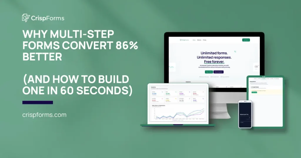
Building Your First Multi-Step Form With Crispforms
Step 1: Open Crispforms and describe your form. Example: “Lead qualification form for a digital marketing agency. I need budget, timeline, challenges, and company size.”
Step 2: Review the generated structure. The AI creates a multi-step form with appropriate pacing. Check that the flow makes sense.
Step 3: Customize if needed. Add branding, adjust wording, modify steps. The AI gives you a strong foundation.
Step 4: Publish and share. Embed on your site, share the link, or connect to your tools. No code required.
The entire process takes about 60 seconds for a standard form.
What to Measure After Launch
Multi-step forms generate richer analytics because you can see exactly where users drop off.
Step completion rate: What percentage completes each step? Low completion suggests a problematic question.
Drop-off step: Which step loses the most users? That’s your optimization priority.
Time per step: Unusually long times suggest confusion.
Total completion rate: Your headline metric. Compare against your baseline.
FAQ: Multi-Step Form Conversion
Most high-converting forms have 3-5 steps. Less than 3 often means too much per step. More than 5 risks fatigue. Crispforms AI optimizes step count automatically.
Yes, often better than single-step. Mobile screens benefit most from reduced visual complexity. Just ensure your form is truly mobile-responsive.
Start with something goal-oriented and low-friction. “What are you looking to achieve?” works well. Avoid starting with contact information.
Yes, almost always. Progress bars reduce anxiety and create completion motivation.
The Bottom Line
Multi-step forms convert 86% better than single-step alternatives for lead generation. The psychological principles are well-documented: reduced cognitive load, progress motivation, and completion bias all work in your favor.
The traditional downside—complexity and build time—has been eliminated by AI form builders. What used to take hours now takes 60 seconds with tools like Crispforms.
If you’re collecting more than 4-5 pieces of information, you’re probably leaving conversions on the table with a single-step form.